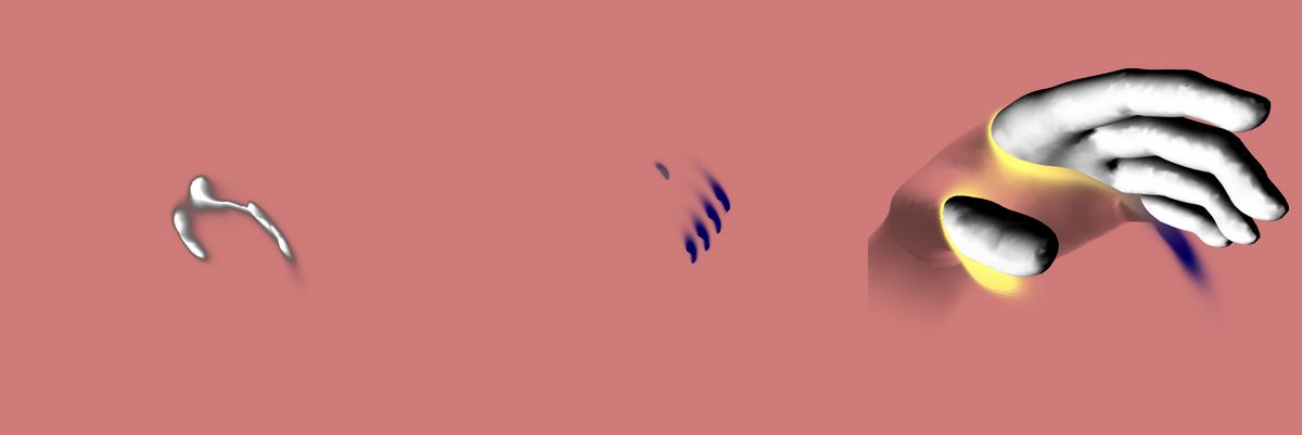
I wasn't quite sure how to make this demo work. It was very last minute, and I was running out of time. But I knew the task of the demo was to somehow get the intersection of the hand and an invisible wall.
If you are a creative developer looking to learn instancing and making demos like the Shaders and gradients demo. I'm pre-releasing the first half of my "Mastering Instancing for Creative developers" course for newsletter subscribers.
It's an excersize heavy course were we'll be making the two demos above while learning about instancing. For the early birds, who get the full course before it officially releases next week, you get a discount of 20%. Get the course here!
At first, I thought, and tried, a classic outline technique would help. It was quickly apparent it would not. The problem was that if I rendered the part of the hand in front of the wall, and then got the outline, then I would have the outline of everything in front, not just a specific wall intersection.
That failed experiment gave me the key insight. To begin, I needed a second render. Then, I needed that render to only keep the intersection, both the front and back needed to be removed. Very roughly, I did just that in the hand's fragment shader, clipped based on depth.
Then exclaimed, "That worked!". Soon followed by the realization of the folly of my overengineering "Isn't this what the camera's near/far already do?
Inspiration
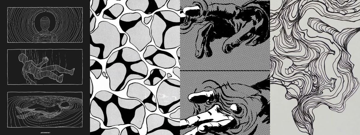
Usually, I refrain from doing full black-and-white things. But this time I wanted to do something with lines and contrast with small big significant splashes of color.
The first demo I made was very inspired by the first image on the left. But when the topic of the newsletter changed, I decided on the hand-through wall idea.
Become a sponsor with your sponsor spot here!
Promote your product/company in this spot to hundreds of creative developers interested in learning and creating. One spot per issue!
Case study
Fake wall Intersection
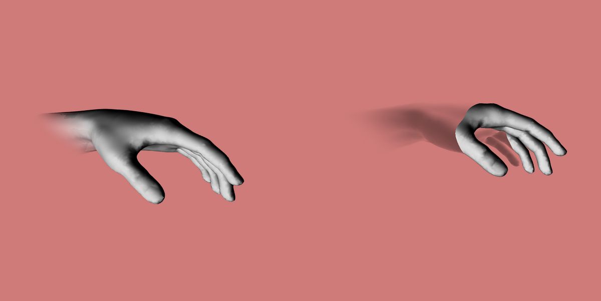
This demo has only two meshes. The hand, and a plane acting as the "wall". However, the meshes don't interact with each other.
Here you can see that even without the wall, the hand effect still applies. The Wall exists only as a surface to draw color GPGPU effects.

Depth coloring
The hand handles the "intersection color" itself in the shader via a quick and dirty depth check inside it's own shader. I just changed the value til it matched with the wall.
if(vDepth < 0.4){
   // Fade the side behind the wall.
}
Clipped rendering
The scene is rendered twice, with a GPGPU simulation in between.
The first render is an orthographic camera that represents the "wall". It has a really tight rendering space: its near is 2.501, and its far is 2.6. This camera only sees objects a really small slice of the world in between the 2.5 and 2.6. This is the exact point where the wall intersects with the hand.
This slide is what "sort-of" gives us the edges of the geometry at the wall intersection point. This is what that camera sees:

GPGPU Expansion
Then, with the edges extracted, the GP-GPU step takes the texture, blends nearby pixels to "expand" the color, and also fades it over time to avoid the whole screen being filled with color.
vec4 current = texture2D(tMap, vUv );
      average += current;
      average += texture2D(tMap, vUv + vec2(0., texel));
      average += texture2D(tMap, vUv + vec2(0., -texel));
      average += texture2D(tMap, vUv + vec2( texel, 0.));
      average += texture2D(tMap, vUv + vec2( -texel, 0.));
      average /= 5.;
The result itself looks like a whole lote of nothing. But when combined with color and then the hand model, it starts to shine
