Scrollers in webGL are a manageable, yet cool starting project. It's one of the projects I made when starting with WebGL. A bare-bones scroller in WebGL looks like:
let parent = new Object3D()
for(let i = 0; i < 5; i++) {
	let mesh = new Mesh(geometry, material);
	mesh.position.x = i;
	parent.add(mesh);
}
Add in the meshes with an offset, and attach them to a single parent. Then, moving the scroller is as easy as moving the parent.position.x. Then, you can start looking at some shaders…
Getting started
- How to create a drag Slider with Curtains.js by Martin
- Creating an infinite slider with Pixi.js by Yuri
- Scroller case study by Luis Bizarro
- Scroller view to grid view by Siddharth
- Codepen of a basic WebGL Slider by Jesper Llamaberg
- Taotajima.jp slideshow deconstruction by Yuri
Wave distortion on scroll velocity
The design of this project by Mitsugu Takahashi is gorgeous. The scroller is positioned as mentioned above with added flare in the shaders. They bend the images based on the velocity of the scroll in the vertex shader:
position.x += sin(uv.y * PI) * uVelocity;
Square slider with local waves
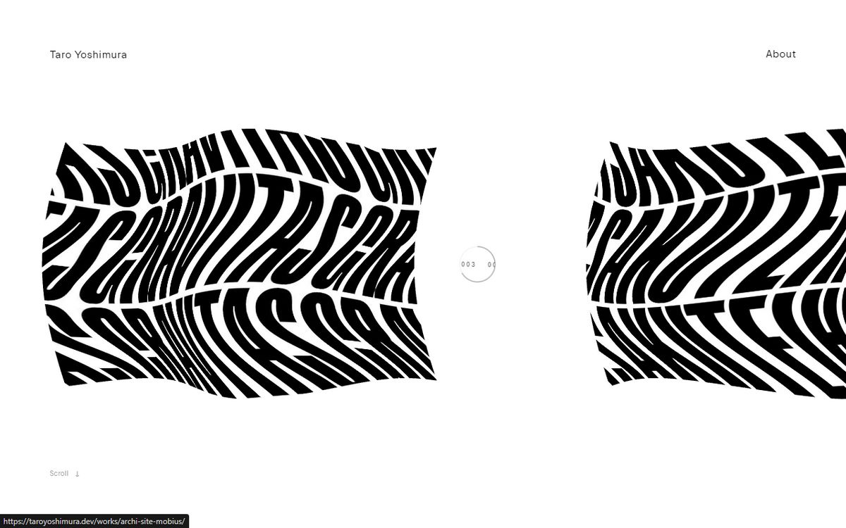
Building on the example above, this demo by Taro Yoshimura applies waves with a higher frequency but in two different axes: x and y
position.xy += vec2(sin(uv.y * PI) * velocity, cos(uv.x * PI) * velocity);Curved Double slider
The examples above all used the UVs to create distortion in local space. Local space refers to the geometry coordinates before they are placed in the world.
This approach works great on the examples above but to give a cohesive effect to all items you need to use view-space (or world-space), like in this Maximilian's portfolio:
vec4 viewPos = modelViewMatrix * vec4(position,1.);
viewPos.z += cos(viewPos.x / uViewSize.x * PI);
Talking to Max, he mentioned he also used two parents instead of a single one to make the lower scroller a little bit faster. And he lerped the velocity to make it smoother when changing directions.
Infinite 3D Scroller
I tend to not like instantly disappearing objects, it feels jarring. However in this project by Fred & Farid it feels great because most items are the same size/shade and the elements are small enough to not throw you off.
Infinite Grid Gallery
The infinite grids, like the one in Mario's portfolio, work by taking objects from one side and placing them on the other side. This all happens out of view, so it looks like they were always there.
The same applies to scrollers, as I did for my Everest.agency Deconstruction. However, since this is a grid, Mario does it masterfully in two dimensions.


