As devs, we focus a lot on the technical. Some of us even write WebGL newsletters. And while we are not designers, an understanding and taste for motion is key for your creative developer repertoire.
Intros set the tone of a website. They capture the attention and show the viewer "This is the experience going forward". Intros are the first point of interaction between the viewer and your site.
Intros need not, or should not, only be flashy pieces of animation or interesting WebGL tech. They can be informative and give the viewer the pattern for the rest of the site like we are going to see in this week's demos
(However, this week's demo is just a flashy piece of WebGL, so enjoy!)
Getting started
- Using ThreeJS with GSAP by Steve Gardner
- Transition Effects with ThreeJS by Akella
- Simple camera zoom-in intro in r3f
- 3D SVG in r3f by Paul Henschel
- How Choonsik's Diary was made
sponsor
Become a sponsor with your sponsor spot here!
Promote your product/company in this spot to hundreds of creative developers interested in learning and creating. One spot per issue!
Learn More!Interactivity tied to Intro
In some sense, these are a bunch of PlaneGeometries. But the intro animation pulls your attention to them. Then the mouse interaction tells you this isn't just some static showpiece, you can play with them. And once, you scroll they become a slider.
Great animations like these not only create excitement and interest, but they also pull your attention to important parts of the site.
Incredible UI to world camera rotation
The site starts as any other website does, with some text centered on the screen. But once you enter it shows you that your view of this website was just a locked-in perspective. In reality, you were part of this 3D world all along. Sort of reminded me of Fez.
This works great because it works on top of your preconceived notion of what a website is. But instead of breaking your worldview, it expands onto it with a seamless transition to 3D. It's a great introduction, yet is a simple camera trick.
Distortion effect
This beautiful animation is done via a post-processing effect. It first renders the scene and then animates up while distorting it until it reaches the final position.
Aside from being incredibly sick animation, this intro works great because it sets the tone whole the whole site. The animation itself is repeated over and over, so the intro sets good expectations of thaw this experience is gonna be like.
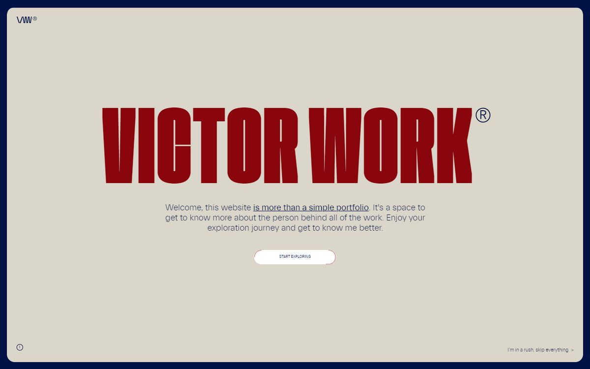
Victor's work of art
Camera, light work, and sound
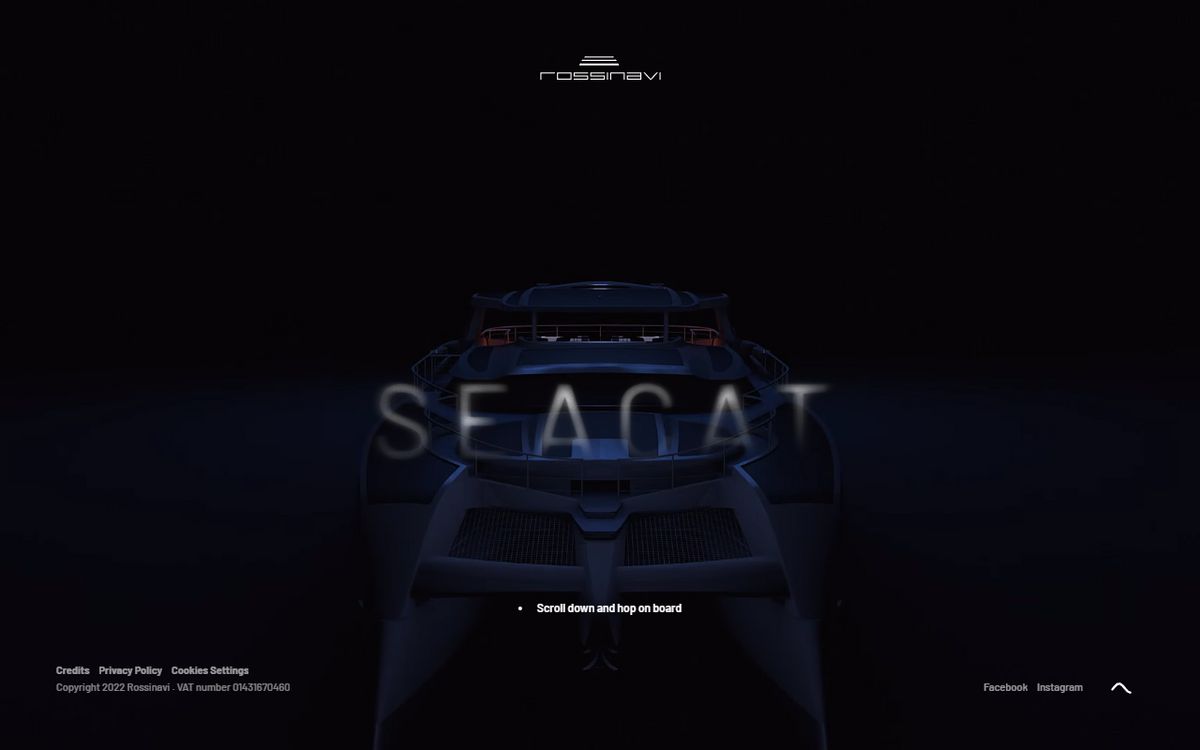
This site by StudioGusto, starts with a nice and soft camera tilt accompanied by sound. While the movement is slow, the sound and lighting put a lot of weight into it.
Sound is extremely important here. I don't know much about sound, but once you enter this site and hear the sound, it almost feels as if you've entered this space yourself.
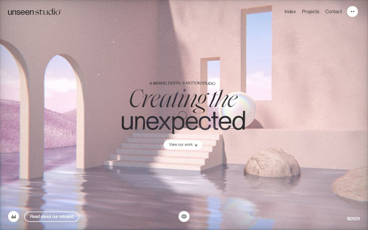
Unseen use of sound
While animating this huge scene, the lovely Unseen folks hit you a flurry of effects that I wouldn't be surprised if I miss a couple.
The transitions have a slight RGB distortion. The camera zooms in with a small tilt. The text has some fluid sim color distortion and it animates opacity with a soft mask. While your attention is on the middle, the header secretly animates in. And then it hits you with the soft Tuuuuuu tu Tuuuuuuu…. tuuuuu…
A lot happens in less than a second. And this week's demo animation camera work and flash effect took a lot of inspiration Unseen. I wanted to add some sound to it as well, but there's only so much you can do in a week….. unless you wanted to hear me humming Tuuuuuu tu Tuuuuuuu…. tuuuuu…

